All posts tagged: quantified self

A new year, a new tool

It seemed fitting to spend New Years in the home of an accomplished clockmaker and ironic that not a single handcrafted-clock accurately announced the arrival of 2016. What the home lacked in terms of punctuality it made up for in English country charm and wood-burning warmth. It was the perfect place to quietly reflect on an eventful 2015 and prepare for the year ahead. In the company of a very reflective friend with a well-developed set of personal development tools, I attempted to glean some wisdom and adapt his methods to fit my goals.Until now, I had only two simple processes that I employed to reflect on my year and set future priorities. For the last 6 years I’ve kept track of my happiest moments and tried to identify any patterns, trends or shifts among them. I also regularly set personal themes to guide my actions over a set period of time, which typically lasted 3 months to a year. My friend introduced me to the idea of using radar charts to rate aspects of life on an …

What remains

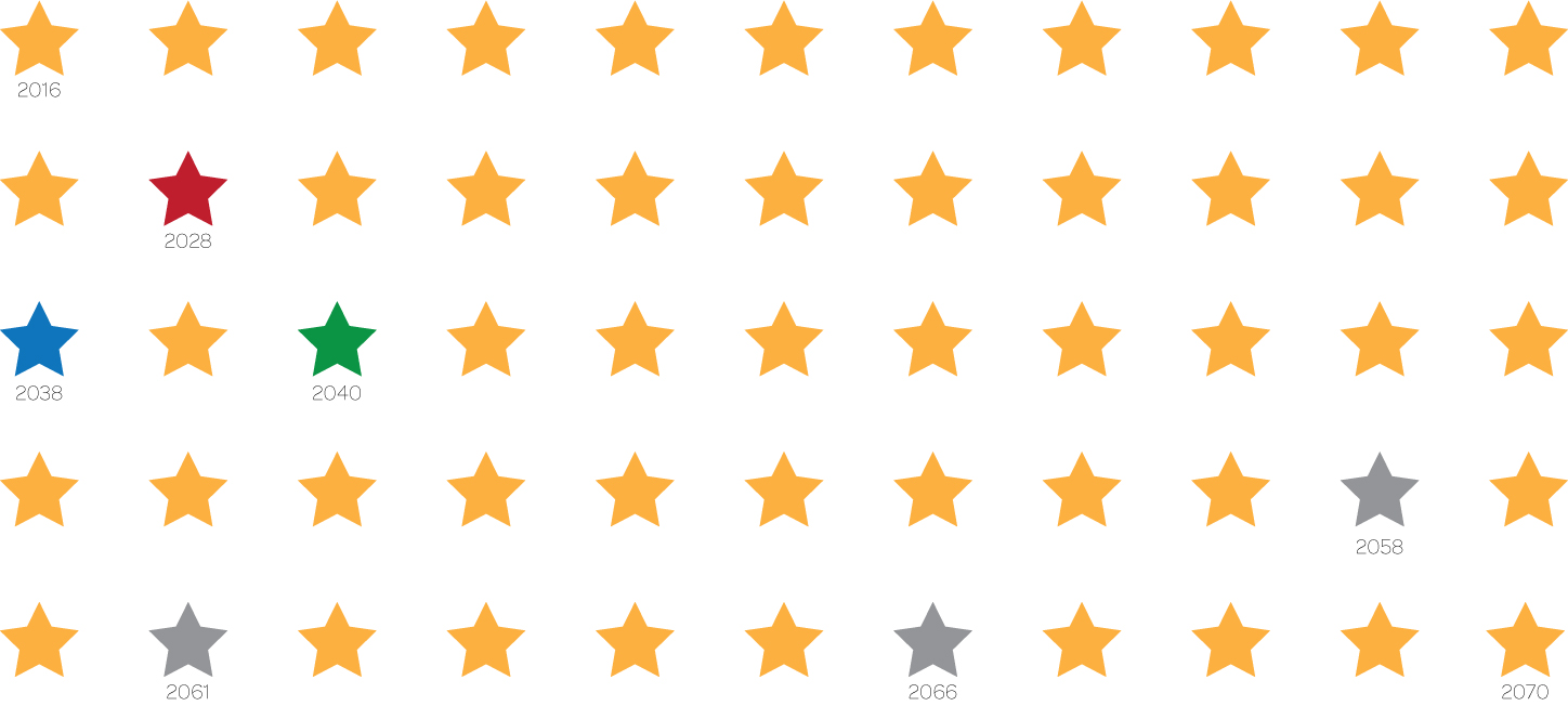
Visualisations can be extremely powerful. I vividly remember reading this Wait But Why post, appreciating how it cut through the noise and compelled me to evaluate priorities. When they revisited the topic a few weeks back it struck a cord, generating a lot of discussion among my network. As a result I decided to make my own version of the visual, focusing only on the time I might have left (acknowledging that each of the moments is a gift and certainly in no way guaranteed). The resulting graphic is above and highlighted stars are explained below. 2028: The year I’ll be 48, the same age my father was when he passed away 2038: The year my mother turns 90 2040: Providing I reach my 90th year, I will still have 1/3 of my life to look forward to 2058, 2061, 2066: My age will be the same as the average life expectancy of a US, UK and HK female (respectively) 2070: My 90th year Seeing the quantity of years laid out in this manner can be startling. There are an infinite number of estimates you …

Identifying motivations and setting goals to match

88 Days, 248+ kilometers, and 1 ger later I have a second ultra marathon under my belt. Actually, I fell off the wagon somewhere between 88 and 60 days before the race, so all of those kilometers were clocked within the last 8 weeks. While I initially hoped to compete in the 100km category, I didn’t log enough distance during my training to have confidence that I could walk away injury-free. As a result, I stuck with the 60km category, where I managed to place 3rd overall among women and 1st in my age group with a time of 7:36. I have to admit, I’m proud of my results and the fact that I was able to “maintain” my fitness level despite returning to a full time job in January. If you’re curious what falling off the wagon looks like, Nike+ does a great job of visualizing that information:The first thing people ask you when you complete a event like this is, “what’s next?” The pressure to up the stakes and seek out an even tougher endurance race is strong. While there are …

Personal storytelling through visualizations

The most ubiquitous way to share personal experiences and stories is through photos. Relatively speaking, they are quick to create and can be instantaneously shared. They’re great for capturing a feeling or special moment, but rarely show change over time or the relationship between two or more ideas. Video does a much better job of displaying these nuances, which is why it has become such a popular medium for storytelling. Collages, photo books, and yearbooks were all born of the desire to provide more context to photos and document experiences. Data visualizations require more data points, a decisive angle and time to craft. However, they can capture a story more holistically, distill information into key points, help share learnings easily, and provide an opportunity for reflection. Finally, the tools to create these types of visuals are available to all and becoming much easier to use.Data visualization and the quantified self My first exposure to data visualization was through an Edward Tufte course in 1999. He is considered a pioneer in the space and his passion is contagious. These days, dynamic visual displays of data …