In my post “Change over time“, I hypothesised that coupling up and separating with someone would have a significant impact on the structure of an individual’s personal network. After my divorce many years ago, my network structure shifted from one that was compartmentalised to that of a ‘sampler’. Little did I know that I would soon have the opportunity to actually test this theory.
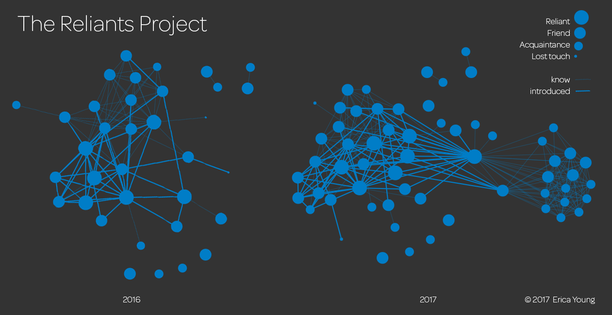
Between 2015 and 2016, I tracked how my London social network grew from a small group of pre-existing connections to a reasonably strong support system. In the resulting graph, I emphasised the role that non-local contacts had in helping me expand my community. Now I’ve taken 2016 data and compared it to the present in a new visual:

The most dramatic differences between the 2016 and 2017 visualisations are the new node sitting at the centre of the graph and the cluster of new nodes on the far right. That central node is my new partner and the cluster to the right is the portion of his London network that he has introduced to me. His dominant London network structure is that of a ‘tight-knitter’, where most of his local friends have all known each other for a long time.
On the left-hand-side of the 2017 graph, you can see that I continued to bring the network together through introductions. The nodes are more interconnected and resulting graph denser. You can also see the introductions I’ve made between that network and my new partner. The cluster of people on the left-hand-side that already knew each other are predominantly work friends.
Over time, I anticipate that the two clusters on either side of my partner will be linked together through our introductions. Whether those introductions form lasting bonds will impact how this joint structure evolves. I will track the data in order to create a time series similar to my previous posts showing how the structure changes over time.
