The most ubiquitous way to share personal experiences and stories is through photos. Relatively speaking, they are quick to create and can be instantaneously shared. They’re great for capturing a feeling or special moment, but rarely show change over time or the relationship between two or more ideas. Video does a much better job of displaying these nuances, which is why it has become such a popular medium for storytelling. Collages, photo books, and yearbooks were all born of the desire to provide more context to photos and document experiences. Data visualizations require more data points, a decisive angle and time to craft. However, they can capture a story more holistically, distill information into key points, help share learnings easily, and provide an opportunity for reflection. Finally, the tools to create these types of visuals are available to all and becoming much easier to use.
Data visualization and the quantified self
My first exposure to data visualization was through an Edward Tufte course in 1999. He is considered a pioneer in the space and his passion is contagious. These days, dynamic visual displays of data popularized by the New York Times are increasingly common and widely valued. If you’re curious, some of their best have been collected here. As for the “quantified self“, the most famous and often sited name is Nicholas Felton, who has been creating beautiful visualizations for years and started publishing a personal annual report back in 2005. I draw a great deal of inspiration from him among others.
Visual storytelling
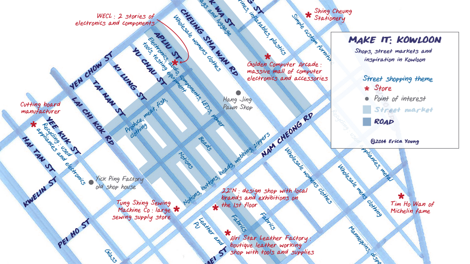
Usually I use data visualization techniques to share my experiences, though I’m increasingly looking to charts and diagrams to explain other concepts, such as personal beliefs and theories. My recent self discovery process visuals have been very useful. I’m by no means an expert, but I enjoy applying these design concepts to my personal life and learning from the process. The image featured above is a map I made of Sham Shui Po, one of my favorite neighborhoods in Hong Kong. It was inspired by Nancy Chandler’s map of Bangkok and designed as a reference for me and other makers to find raw materials and components for our ideas.
 Last fall I created this map of Langtang Valley, Nepal to share my trekking experience. It was a great way to document the journey, which couldn’t have been captured in a single photo and would have taken far too much effort to capture through video. The visual provides enough data to be interesting without requiring a lot of time or effort from the viewer. There are countless ways in which it could be improved, but I’ll save those ideas for future treks.

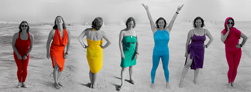
The photo above is a compilation of 7 taken over my week at Burning Man in 2013. My playa name is Aurora and the goal was to capture my costume, which if seen on a single day wouldn’t be immediately obvious. This effort required some advanced planning beyond the costumes themselves, but was well worth the effort and allowed me to share a piece of that very special experience with family and friends afterwards.
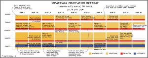
 Similarly, I documented my Vipassana meditation retreat to share with others curious about the experience. Since our routine was very strict, I tried to capture the consistency through a schedule visual and highlighted the meaningful moments using annotation.
Telling your story
Here is a set of thought-provoking questions to ask before, during and after in order to help you plan, gather and process the information into a compelling and valuable visual.
Before: What information do you think you want to capture? What are the best / most convenient tools to capture that data?
During: Does the data you’re collecting help tell the story of the experience you are currently having? If not, what can you change or improve? What anecdotes do you want to remember and share?
After: What does all the data you collected mean? What is the key message that you want to project? What is the clearest way to display that information? What are the right tools to create that visual?
Tools
Flowing Data and Visual.ly are great resources for ideas and tutorials. Bloomberg has assembled a great list of dataviz heros here, with many famous graphics you’re sure to recognize. This neat little flow chart helps determine what chart style will best fit your needs. This list of quantified self tools is really comprehensive. Below is a list of tools I have used to capture data and generate visuals:
- Diagrams using Lucidchart
- Exercise data from my Nike Fuel Band (which has been discontinued, but there are great alternatives like FitBit)
- Infographics using Daytum and IBM’s Many Eyes
- Maps using Google’s map engine (though modest maps looks really cool)
- Personalized handwriting using My Script Font
- Vector-based drawings with Adobe Illustrator
At this point I haven’t explored making any of my visualizations dynamic, but D3 and Google Charts seem to have some helpful tools and I look forward to playing with them in the future.

Pingback: Graphics tell stories | with ease